Templates Complete
Today, 4 more templates are converted to 3 column Beta xml templates:
TicTac
TicTac Blueberry
Tekka
Sand Dollar
To temporarily view TicTac visit my test blog. As always you can download all the code for these template at Blogcrowds.com registeration required.
This is it people, now Blogcrowds has all Blogger Templates variation and all in 3 column, get them today.
Merry Christmas & Happy Holidays!
Moto & Snapshot
Blogger Beta XML templates Moto & Snapshot series converted to 3 Column!.
They include:
Moto-
Son Of Moto
Mr. Moto
Ms. Moto
Snapshot-
Snapshot: Madder
Snapshot: Sable
Snapshot: Tequila
To temporarily view Snapshot: Tequila visit my test blog. As always you can download all the code for these template at Blogcrowds.com registeration required.
I'm on my last stretch, just 4-5 template before I complete the entire blogger series! Hopefully done before Christmas :D.
Happy Holidays Everyone!
Rawk! & Thisaway
Rawk! and three column Thisaway added to our collection of of Blogger Beta Templates!
K2 Beta-fied
I took sometimes and betafied another template!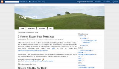
This is the K2 template, as most people probably know, distributed by Geck & Fly; now it supports blogger widgets & labels as well! This template is quite beautiful, so hopefully as soon as I hear back from the Geckofly people, everyone will be able to get the code from Blogcrowds :D
Scribe Font
In beta, blogger replaced the once elegant Scribe font used for labels with a more generic font. However, not to worry, find out more about the font used in original blogger here at Blogcrowds
Templates
Blogcrowds.com has been offering free blog templates, notably 3 column blogger beta templates, to many bloggers out there. Today, we have decide to implement a new way to distribute these template.
Before, bloggers had to post requests under Customize Template forum and recieve the templates via email. Now, most of the available templates are posted under Template Code where, if you are registered, you can simply view or copy and paste these templates. However if you need more customization, please still post requests under Customize Template forum.
Thanks
Save Your Blogger Widgets
The new Blogger is built around their new widgets. Widgets makes managing long list of links, profile, layout of your template etc easier with no HTML knowledge required. Widgets also make the template code much cleaner by saving all the necessary code on Blogger servers. However, this does present a problem if you constantly change your template like I do as simply backing up your template won't work if the widgets are deleted on the Blogger server. Many people re-populate their entire link list manually, fortunately, there is a way of saving your Widgets.
What Not To Do
The trick of course to saving your Widgets of course is never delete them, which means do not use the upload button in your Beta Template section and if you ever see the scary warning that Widget are about to be deleted, cancel whatever you did immediately.
The Correct Way
So, if you can't upload your template straight into Beta what should you do?
1) Make sure you template is in Expanded Widget mode.
2) Find your widgets and copy them from the
3) Open the template you want to switch to and delete your old template (back it up first if needed) and paste your new template into the edit HTML section
4) Find where you want to put the widgets, most commonly sidebars, and paste the widget code you had earlier between the
5) Preview your template to make sure everything look good, save it and you are done!
I know this is probably a lot more work than you would do otherwise, but it save a lot of time if you have to type all your links over again.
Thanks, hope its helpful, article also mirrored here


Sidebar Bar Slipping Solutions
Sidebar sliding to the bottom of the page is probably the biggest problem bloggers have with layout coding. This problem usually occur when an image or link is taking up more room than its suppose to; without enough space, the sidebar slide down the page. So, to solve this problem, usually people would recommend finding out which image or link is causing the problem and
remove it. However, there are two CSS methods that could solve this problem and they may be easier than going through a huge amount of content to find an image or a link.
Method One: Word Break
word-wrap: break-word;
add the above to the container, usually main content and sidebar column
This method is used in all blogger beta templates, as it suggests and as commented in the templates it "fix for long text breaking sidebar float in IE". It will break long text and links, but it won't work on images.
Method Two: Overflow
overflow:auto;
or
overflow:hidden;
add the above using either option auto or hidden to the container, usually main content and sidebar column
This property controls how overflows are rendered in a web browser for all overflowing content, link, images, and anything else. With first option auto, if anything is larger than its container, the container itself won't expand, however a scroll will appear in the container so if want to see the
entire image or link, you can scroll across as you can see in the second post at Blogcrowds Forum. The second option hidden, will tell the browser not render anything overflowing its container so part of the image or link will be cut off.
Cross-Browser CSS Tips - IE 7 Part III
As I continue to code CSS & HTML for multiple browsers, I find that if you follow two 'simple' rules, your design will most of the time come out pretty much the same in all browsers.
1.) Never use padding along with width
This is probably the cause of the biggest headaches as IE 6 renders padding incorrectly. To make everything look the same in browsers, you will probably have to do some extra math and use an underscore or star html hack to set the width differently for IE. So it is advisable to never use paddings with width. If you absolutely have to use padding, create another container (div, span, p etc) and set its margins.
2.) Always remember to clear your floats
This is an IE problem that shows up most commonly in Firefox or Opera. Confused? Now let me explain. In IE 6 even when you don't clear your floats, the parent container will still rap around the inner content. However rendered correctly, the parent container would only appear for maybe five pixel at the top of the page and your child container seems to break out of its parent container and extend to the bottom of the page. So in Firefox when you see your parent container appearing only at the top of the page for a few pixel, remember to check if you cleared your floats or not.
Please keep in mind that these are tips for rendering designs the same in different browsers and not tips for how to code CSS. For example with tip number one, if you put a div that is 800 pixels wide with 10 pixels margin all around in a div that is only 800 pixels you will still get an expanded parent div, but at least it shows up the same in all browsers; whereas if you put a div that is 800 pixels wide in a div that is 800 pixels with 10 pixels padding, who knows what's gonna show up.
IE 6 Standalone - IE 7 Part II
Now that I have upgraded to Internet Explorer 7, it of course removed Internet Explorer 6. This present yet another problem for browser testing for IE 6. It is not possible to run to versions of Internet Explorer...now wait a minute, here's something interesting, you can download the standalone version of Interenet Explorer 6 here. Simply download the last file, unzip the file and put everything in a folder somewhere and you're good to go.
Because of the standalone IE probably use some functions from the shell, which is integrated with Internet Explorer 7, you can see some of the feature from IE 7 in the standalone such as the little icon for some sites in the address bar. Don't worry though, the standalone still renders webpages incorrectly just as IE 6 does...in this case, that is a good thing.
Internet Explorer 7.0
Like many others, I upgraded to Internet Explorer 7.0 from Internet 7.0 Beta sometimes last week. I didn't give a second thought about it since Firefox (version 2.0 was release a week later), not Internet Explorer was my native browser. Not until yesterday did I get a huge wake up call to do some browser testing to see my sites show up ok in 7.0.
Internet Explorer 6.0 and below are notorious for not conforming at all to the CSS/HTML coding conventions and your webpage show up in a mad jumbo. Why I don't know, all I know is how to implement some inconvenient but absolutely necessary CSS hack to make sure everything shows up at least close to how it is suppose to look in Firefox and Opera (I mostly use the underscore '_' hack and star html '* html' hack for IE 6.0).
To my great relief, when I typed in http://www.blogcrowds.com in the IE 7.0 address bar, my site Blogcrowds.com showed up fine if not better in IE 7.0. That, I give my thanks Bill Gates :).
I guess the reason that I forgot about testing my site for IE 7.0 and not testing when I got IE 7.0 Beta was because I thought most users will still be using IE 6. My initial thought, perhaps influenced by some 'internet browser trend analyst', was that IE 7.0 will be shipped with Windows Vista sometimes in early 2007 but most users who does not switch to Vista will still be stuck with IE 6.0 for another couple of years and still taking up most of browser population. Now it looks like IE 6.0 will be obsolete sooner than I expected (hopefully), which is a very good thing and I could stop worrying about hacks :D. Something else I will be looking forward to is the 'new' age of online images with .PNG for better qualities and transparency (which isn't really recommended because IE 6.0 does not render transparent .PNG properly). And again, thanks to Bill Gates.
Blogcrowds Directory Launched!
I am happy to announce that Blogcrowds.com has launched its own directory at http://www.blogcrowds.com/directory/. Feel free to add your blogs to our directory, it however does require a recipical link as our directory is not a 'no-follow' one like many other directories and every link included in the directory goes toward Page Rank as well. Thanks.
Over the next period of time we will also look for some feedback on the directory, categories etc. So please post your comments about the directory in the feedback forum. Thanks again
4 Column Blogger Beta Template
I have a request for a four blogger template (see it here). So I sat down today and tried my hands at his. You can go to http://blogcrowds.blogspot.com/ to see my progress so far.
If you have any similar request/changes feel free to visit Blogcrowds forums and get in touch :)
3 Column Blogger Beta Templates
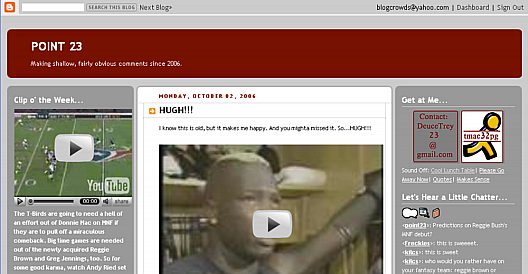
I have finally had time to sit down and modify some Blogger Beta Templates. Today, I did all the Rounders template so all the new blogger features are included with labels and everything. You can also see the Rounders 2 template at work at http://point23.blogspot.com/ and Rounders 4 template at http://blogcrowds.blogspot.com/. If you wish to use this and other templates free please click here.
Tommorrow I will probably modify the 565 and 897 templates than maybe the rest of the Blogger Templates or finally converting my own templates. Thanks :)
565 3 Column Template
I have modified the 565 blogger template into 3 column liquid Click the image to see it at work. To use this and other templates free please click here. In the mean time, I'm also interested to exchange links with someone who will use this template on my template section.
Icons Icons Icons!!!
IconBuffet is addicting. Sign up and be prepared to get caught in the icon mania.— Traci Knoppe
The above quote is taken from IconBuffet and it quite literally describe the site. Once you signup for the site you are instantly addicted to the nifty icons offered. This addiction will probably only be rememdied when you collect all the icons on site and every decent icon on the web. So go to IconBuffet right now and check out the icons!


If you wish to obtain some icons from me for free just leave your email address here, enjoy.
Scribe 3 Column
I have modified the blogger template Scribe into a three column liquid template.
Click the image to see it at work. To use this and other templates free please click here.
Font
Most people are probably satisfied with the fonts pre installed into their home computer. However for the rest of us and the typophiles (not sure that's a real word) there is never more than one font that satiifies the task at hand. Fortunately there are many font site out there that allows you to buy or download a font for free.
To conclude I will show some fonts I used in my templates:
Neuschwantein: Street Sign

Blogger Beta: Editting HTML with Label
Everyone probably know by now to use new Labels in Blogger Beta means you cannot edit the HTML/CSS.
From editing my MySpace profile, I'm use to this kind of thing. So to add html or css to the Blogger Beta WITH the new feature such as labels you can create a post, in the Edit HTML section add your CSS and HTML make sure there is no unwanted HTML markup such as Blogger adds automatically, double check this, even when you think there is none left, blogger may add one at the end, so its advisable to enter everything in a line. Here's a sample.
Of course, this makes editing template a bit difficult (not as hard as myspace though), by only changing the stylesheet. Those of us who just editted the CSS & left the HTML alone in the original Blogger would be very lucky indeed!
Blogger Beta Nav Bar Update
This is completely outdated, there is a far more efficient technique available just insert
#navbar-iframe{
visibility: hidden;
display: none;
}
Somewhere in your css styling.Update for the previous Blogger Beta nav Bar hack step #3. Instead of of step #3, you should change whatever the container of the entire page is to its original. Then add this to the styling css:
#center{
position:absolute;
z-index:20000 !important;
top:0px;
left:0px;
}
then in the html add the following to the beggining of all your content <div id="center"> and </div> to the end of all your content.
For more information and tips & tricks please visit again soon or sign up at Blogcrowds.com.
Blogger Beta Nav Bar Hack!
This is completely outdated, there is a far more efficient technique available just insert
#navbar-iframe{
visibility: hidden;
display: none;
}
Somewhere in your css styling.By now everyone has probably heard of new Blogger Beta. I personally didn't sign up until someone asked me for Beta assistance. One of his problem is that the usual code (visibility:hidden) used to hide the navigation bar does not work in beta. So,I approached this problem and found out that Blogger Beta linked the nav bar in iframe with external CSS instead of a hude jumbo of javascript and any code you add does no effect the nav bar styling.
So, I took a different approach and decided to block it instead, so here is what I came up with, please do not copy anything in red, they are comments:
1.) Add the following to the css styling
#block{
width:100%;
height:40px;
background-color:rgb(232, 234, 236); change to your own background color
z-index:10000 !important;
position:absolute;
top:0 !important;
left:0 !important;
}
2.) Add the following anywhere in your body tag
<div id="block"></div>
3.) This step is optional and needed to be changed for your own template
#container{ or whatever that wraps around the content
position:absolute;
z-index:20000 !important;
top:5px;
left:110px;
rest of your styling goes here
}
The top and left property may need to be adjusted. Please note, this technique will not center the content in all browser resolutions, I'll come up with a solution shortly(I already have something in mind, just needs to be tested first).
Please credit this hack to me, and for more information and tips & tricks please visit again soon or sign up at Blogcrowds.com.
I want to conclude to say that I came up with this hack merely because someone asked me to solve a problem, I have no problem with the Blogger nav bar, I show the Blogger nav bar in all my blogs and use it quite often :).
Field of Dreams
The newest edition to our template collection! Yep you are looking at it, Field of Dreams currently used as this blog's template. If you wish to use it please check out the links :)

Background
This is the first of what I hope to be a series of entries about various important CSS elements essential in blogger templates. So I am going to start with the ever present background element
Why Use Background
There are basically two ways to insert an image into HTML, one by applying the image as foreground using <img> tag or background using background CSS style. Generally you would use background if there will be text on top of the image or the image is very small and part of the decorative element. Otherwise, for the content of your web page use the <img> tag.
Background Properties
There are five basic background properties:
Background Color - color hex / color rgb / color name / transparent
The default property is transparent. The other three choices are different ways to express color on the web. An example of hex is #000000 or #000, rgb is rgb(0,0,0), color name is black. Background color is often used in combination with background image to save image size.
Background Image - url / none
The default value for background image is none. The url property is used to link the background image to an existing picture.
Background Repeat - repeat / repeat-x / repeat-y / no-repeat
As the name suggests background repeat determines if the image applied to the background should repeat or not. This property is also used to save image size and can be seen in Neuschwanstein where the entire background is a repeated tile. The default property is repeat while the three other value are pretty self explainatory repeat-x mean repeat along the x axis (left-right only) repeat-y mean the y axis (up-down only) and no-repeat means no repeat.
Background Attachment - scroll / fixed
The default property is scoll which means the background image will scroll with the scroll bar while with the fixed property the image will always remain on the screen no matter how far down the screen you go.
Background Position - top left / top center / top right / center left / center center / center right / bottom left / bottom center / bottom right / x-% y-% / x-pos y-pos
The background position is used in combination with your background image, it dictates where the image will start. The values it take are listed above and the numerical values goes left-right first then top-bottom.
Finally there is the Background: property is self, it takes all of the above background properties recommended in the order they are listed, saving a lot of precious time :)
3 Column Liquid
I have just finished modifying blogger templates so that all of them are in three column liquid layout.
So far I have done 565, 897, Dots, Minima, Rounders, Scribe and most of their variations. To use these templates free of charge please click here.
Meanwhile, because of the amount of templates, instead of creating a blog to showcase each like I do with my own templates, I would wish to link to people who uses these templates. Because of the possible potential of this blog, link from this blog maybe very advantageous. For more information please also go to Blogcrowds.
The rest of blogger template modifications are coming soon.
Thanks.

Medieval Templates
The two templates Neuschwanstein & Abode of Crow I made initially with a castle/medieval theme in mind. These two templates shares many things in common. They are both centerpieced around the theme developed by their header.
Abode of crow features the ancient remains of a tower on an omnious day with crows flying overhead. The brown and purple used enhances this mood to a point that I wish I had sound tracks of crow kaw to add to it.
Neuschwanstein is a Bavarian Castle with an interesting history. Because of this, the template somewhat focuses on a regal, fairy tale theme. To develop this theme an original photo of the castle is enhanced. The photo is recolorized for a monochromatic blue with blue and sharpening applied for a more picturesque appearance.
I found the font English Gothic 17th Century combines very nicely with both template. For more information about the two templates click on the respective links. To find out how to get his template click here.


A Lot Of Work Ahead!
Alright just finished designing this blog. As you might have read above, this blog is created about Blogger templates and more specifically about design/coding. So feel free to ask me any question here or at Blogcrowds.com.
This blog right now has a modest collection of blog templates (links to the right) however, I hope to change that soon. My first project is to make modifications to all the exisitng default blogger templates. Hopefully this won't take too long so visit again soon!